Monday, February 21, 2011

Mo-oooom! He's Copyin' Me!!!

OK so maybe I've been around the kids too much. Is there such a thing? Yes, yes there is ;) That's why we have Girls' Night.

Anyway I have recently been asked what is a good way to copy protect digital photos for use in Facebook and other social media albums. I am a fan of "easy" so I will demonstrate my favorite go-to copy protect: the watermark.

A watermark is simply strategically placed text on your image so that a person can still enjoy the photo but cannot pirate it for their own purposes without your explicit approval. Some people who are bigger time photographers that have a career in that field will put large but translucent watermarks on their work to ensure that no one will copy and then crop out or photoshop the watermark out of existence. Myself being smalltime currently I just kind of meekly stick it in the bottom corner most of the time. The choice is yours and you can easily try a few different techniques in Picasa.

The first step is to of course import your photos into Picasa. I use Picasa for all my importing needs to get the photos off the card and into the computer because I really like the user-interface's simplicity. Once I have my photos how I want them and in the final stage I export them as a smaller 1024 pixel file. These exports are the ones that I post on Facebook or use for blogs. They are easier to work with and ensure that no one ever gets my large file even if they copy it. You could use an even small format if you want. It doesn't really matter.

The export process in Picasa has an easy watermark field at the bottom which will place the same text you enter in the bottom right hand corner of each of your photos:


Here is how the photo will look when you click on Export:

(red box for illustration purposes--does not show up on photo)

It does the trick but someone could easily crop that out or clone over it if they really wanted to.

The method I have been using is to export the photo but do not check off "Add Watermark". Instead I then open the photo I want to mark and click on the Text box:
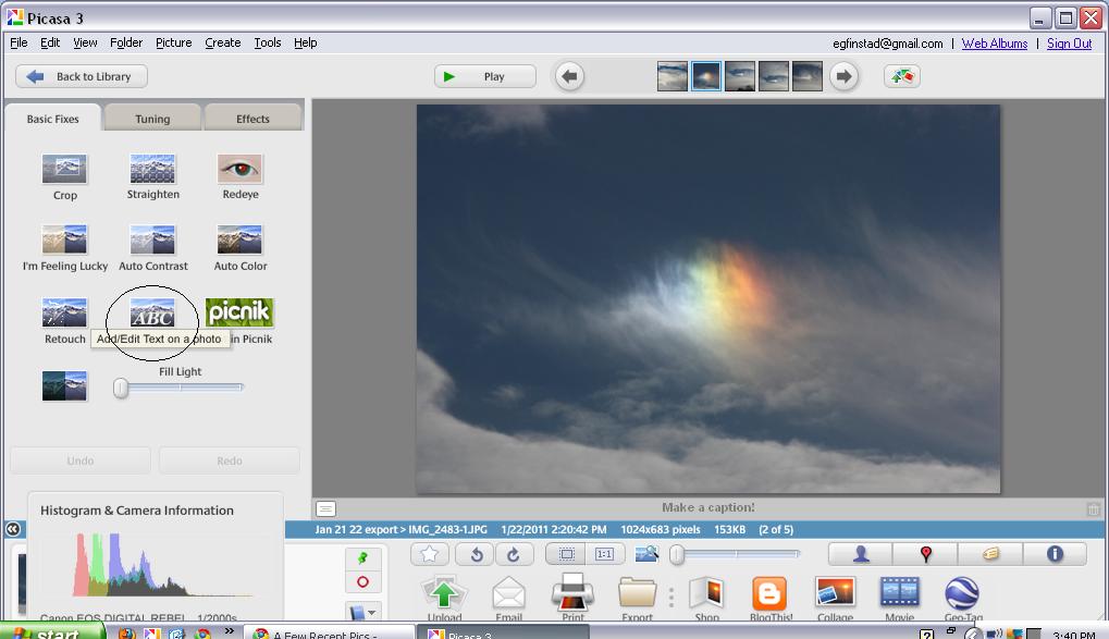

Click on image to enlarge

From here the photo will then say "Type anywhere to add text". You simply need to just start typing and a box will appear on the photo with your text in it. You can move this box anywhere on the screen. You can control the color, size, font, opacity (translucence), and placement:


Click to enlarge image

In my example the translucency is up all the way to allow for the color I chose to be seen easily. If you use a larger font size I recommend dropping the translucency half way down. Be sure to click "Apply" to keep the text on the screen.

The next step is to go back to the library screen and on the folder containing your files click on the Save icon:


Click to enlarge image

If you do not click on Save it will not keep your watermark on the photo when you go to upload it!


Final Watermarked Image

Here is some general info on Copyright laws:


Do you have any other suggestions or good articles about this topic? Please leave a comment below!

Monday, February 14, 2011

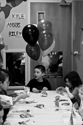
Gymnastics Birthday Party

I am so lucky to have a great friend who lets me come along to her events and take pictures. Its wonderful practice for me and I get to spend time around some great kids. This past Sunday I got to attend her son's 6th birthday party (and my own older 2 kids got to go too and had a BLAST) at a place called Regal Gymnastics in Winooski, VT. The lighting was poor in the gymnastics area and my external flash has not been cooperating lately so I had to rely on the built-in flash which is so-so and also my "skillz" with the ISO/Aperture/Shutter/White Balance/Light Metering.

At first my flash was working just fine, but after taking about 20 pictures in a row and saving them in RAW format it suddenly started to say "BUSY DAMMIT" and wouldn't take pictures anymore. This is my worst nightmare. Luckily it was not something I was getting paid to do but I am a perfectionist and a control freak, remember? If I closed the flash and opened it again real quick it would work again but it kept happening. So with a sigh I turned the ISO up to 1600 (the highest my camera would go) and put the shutter at 1/100 and the f-stop at 5.6. This only really seems to spell one thing with me: NOISE. I don't know if I am doing something wrong or what. I had to have a fast shutter speed as it was GYMNASTICS and these were all 6-10 year olds high on sugar. Anything less than 1/100 was not worth taking.

At first I kept it in RAW and each photo looked fine on the screen. But when I started to run out of disk space I dropped it to JPG. In retrospect I wish I had just had it on JPG the entire time. I used Lightroom to edit and fixing the luminance/color noise does not look right when you export into a JPG file which is what I end up having to do. The ones I took in JPG were easier to edit and looked exactly the same when I exported them from my external drive to my hard drive for uploading purposes. I need to do some more research into why it is soooo grainy and if there really is no other alternative than to get a new external flash. The one I have is not fully compatible with my camera as it is an older Speedlite made for a SLR, not a DSLR.

Here are a few shots from the party:


Update: While working on the indoor shots in Lightroom I decided to click on the "HSL" section which is Hue, Saturation, and Luminance. Using these three groups of color controls combined with the Contrast slider I found I was able to produce MUCH more desirable results. Now I want to go back to some older pics and see if I can fix them also. Its such a learning process.

The top pic was before I used the HSL controls:

Note the skin tone is greenish and the red blocks are orangey. Couldn't get rid of it with saturation removal alone...


Now she looks a little more natural and less zombie-like! Still darker than I would want but hey what are ya gonna do...

Friday, October 15, 2010

Shooting Foliage

Lake Arrowhead, Milton, VT
As you may or may not know I live in Vermont. One thing we are known for here besides farming and Maple Syrup is the amazing foliage our Green Mountains have on display every year. Most years I have not even really stopped to take stock in how gorgeous it is or how many photo opps I had. I am afflicted with S.A.D. and it always kicks in this time of year.

Always, that is, until this year. Having this DSLR camera and the capability to express myself artistically in a way that fits my lifestyle (i.e. 2 schoolies and a 1 year old) has done amazing things for my depression. It gets me out there, it gets me thinking of new ways to look at things, and it distracts me from my demons. Even if no one will ever see the hundreds of thousands of photos that I have taken over the past few years and into the next part of my life at least I have one more day here on this Earth.

OK enough about me. Let's get to the foliage! Well since I have had several absolutely breathtaking days to get out with my camera and the stroller (or the baby hiking backpack) I probably took about 1200 photos. Not kidding. Of course I whittle them down to several hundred, and ultimately share about 250. One of the issues I ran into was the positioning of the sun's effect on what my camera chose to wash out. If the sun was behind me, great! The sky came out this vivid blue and the leaves were their brightest orange, yellow, red, and green.


BUT if the sun was in front of me at all, or to the side, it would wash out the sky and make the leaves look dark and yucky:


You can see by the upper left that the sky is blue with some clouds in it but let's be honest, this picture is kind of blah.

What is happening is the camera metered the amount of light it would need based on the darker tree, which in turn caused the sky to be overexposed. There is something your camera does called White Balance. Most cameras, even the one on your phone, have a way to adjust it. Auto white balance is good for beginners, or if you had a sunny day like this one you would set it to Sunny. Also you can try dialing the exposure compensation down a few notches which would tell the camera to take in less light data. Another thing to try is to quicken the shutter speed, and/or tighten up the aperture a bit. It will take some playing around to get it just right. The photo below is an example of the Aperture at F11 and the Shutter Speed at 1/1000 of a second. Oddly enough, I accidentally left the ISO at 800 which normally would have overexposed it but the shutter speed was so quick it didn't matter. It may have had an even darker blue sky if I had set it to 200 like I should have!


Wednesday, October 6, 2010

Overexposure!!!

I was lucky enough to do an 11 person family portrait over the last weekend. It is fall here in VT and it has been super rainy. We had hoped to do it by a picnic area locally but this is what it looked like after we got 4" of rain in one day:

From Flood!!!!


Yikes!! So we had to nix that idea. Luckily the backyard of the family has a nice tree line so we were able to utilize the space there and creatively so! The owner has a daycare so there are lots of fun play structures in her fenced in yard but we were able to work around them and also use them as "props" for a few pics!

The problem, and the reason for my post's title was that the sun came in and out that day. It was a gorgeous day don't get me wrong, but we did the session at noon and there were lots of little clouds going over the sun and then leaving. Direct sunlight at high noon even in the fall is a little hard to work around when taking photos of people. You want them to come out natural looking, not pasty ghosts!! I found that when the clouds would cover the sun they came out great, but then all the sudden I would be snapping away and BAM the sun would blaze down. Sadly some of my best poses (you know, the ones where everyone was actually looking at the camera!) happened during these times of brightness. My camera was set to handle the cloudiness so those came out washed out looking. How do I fix it? I can't afford the fancy photo editing software at this time so I am using Picasa for all my needs. Picasa doesn't have an obvious exposure fixer at this time. These are the options for "Effects" editing:


Lots of fun stuff, but how do I fix a photo like this:


I scratched my head and even wanted to cry for a minute. This family is rightfully expecting their photos to look professional. I am a perfectionist and I also am afflicted with clinical depression. One way I have found to deal with both these issues is to try things that perhaps no one else would try. Sometimes those are the things that work the best. I clicked on several of these effects to see what would happen. I am not afraid with Picasa because things are so easy to reverse and the program saves a backup of your originals automatically.

The last one I tried is the one in the bottom right hand corner called Graduated Tint. It's description says "Useful mainly for skies". Well, there are no skies in my photos but let's see what happens anyhow.


Voila! It worked!! I kind of like how Picasa doesn't hold your hand completely through everything (perhaps they don't know all of the program's capabilities in every instance anyhow...it IS a Google program and they like you, the user, to explore!) so that you can make these reaffirming discoveries on your own.

The trick to using Graduated Tint is not to touch the color palette at all. Simply click on the icon, then use the "Shade" slider moving to the right to darken the exposure until it looks halfway normal.


You will also notice a target in the center of your photo.


What I did with this was drag it all the way down to the bottom of the screen to give the entire picture an even exposure change. The purpose of the target really is for skies. If you have a horizon line like this:


You see how the way the camera metered the light was based more on the darker lower half of the screen where the land and trees are. The sky looks washed out. This will only work if you can see SOME color in your sky. If you have one of those completely whited out skies it will really not help at all. What you do is put your target just above the horizon line and then start sliding the shade lever over. You will see the colors in your sky look more and more natural. Make sure you don't over do it though or it will look freaky. Then use the other slider, the Feather slider, to blend the bottom so that it looks like you never did a thing ;)

(Note: I also used the Shadows tool to bring out the colors in the trees, and the straightening tool to turn it slightly which removed the telephone wire in the upper right corner! Told you I am a perfectionist lol)

I hope this was useful for someone out there! I know it saved my butt :)

Friday, September 3, 2010

Aperture: Wide vs. Narrow

One thing in photography that intimidated me was Aperture. The word itself seems scientific and foreign to me.

One thing I have tried to do in my life since Kindergarten was to understand those things which scare me. I have done it with math, physics, spiders, and now the inner workings of a camera. I'm not claiming to be a genius in all these subjects but I feel that the best way to get over feelings of self doubt and ignorance is to face something head on that scares the crap out of you.

OK well enough life lessons, let's get to the Aperture!

Basically what I have found is that the wider the Aperture (which means its letting in more light as a whole) the blurrier the background is (which can be very pleasing) and the smaller the Aperture the more in focus the background is. I spent some time pondering why exactly that is. To some people with a logical brain the answer may be obvious. But I am an abstract thinker so it takes me a few minutes :)

Here is an example of a wide open Aperture on a sunny beautiful summer day:


Notice that the Goldenrod in front is sharp and crisp and the stuff in the background looks kind of mushy and soft.

Now here is an example of a narrow Aperture opening, same scene, different orientation:


What I feel is that when you let more light in the camera is only able to record what is directly in front of it in the short time the shutter is open, leaving the stuff in the back to be present but not as sharp. When there is a more focused amount of light coming in the camera is able to "see" more without being overwhelmed. Aperture Priority (Av) is one of my favorite settings. There is a lot you can do with it and it can bring emotion to your photos depending on subject and lighting!


Saturday, July 17, 2010

White Out


Last night I was playing with a bunch of wildflowers that I picked and put in a blue glass vase. I love the vibrant yellow with the cobalt blue, but how it looked on my table in the photo just wasn't doing it for me. The background is my messy kitchen (its clean now thanks to a few hours alone this morning yay!!) and the colors don't really pop. Also the vase, which is simple and beautiful, doesn't get the full attention it deserves.


It was late afternoon and the sun was on the other side of the house. I am sure it doesn't really matter for this trick as long as there is daylight at all. What I did was arrange the vase and
flower so that I would be facing the large sliding glass door with my camera. I pulled my gauzy curtains shut (probably does not matter if you have them but I think it helped a little) and removed any objects that were in front of the door. I put my camera on Manual. Next, I opened up my aperture as wide as it would go on my 18-55 mm lens. I set the shutter speed to 1/13 of a second and my ISO at 400. Here is the result:

Simple, elegant, and I think would make a great print! I think I will get one made. I have done nothing to this photo except retouch a couple of shadows on the edge. I may further retouch to remove the slight shadow on the right hand side, but as far as the lighting effect here that was all camera!

Play around with flowers and lighting! You can get some really neat results!

Wednesday, July 14, 2010

Soften Up


Sometimes you just want a photo to focus on one thing, and have everything else kind of fade into the background. This can be achieved in two ways. The above photo was processed using Picasa. I opened the photo, clicked on the Effects tab, and chose "Soft Focus". This creates a central focal "circle" that you can adjust to widen or constrict. There is also a slider bar to adjust the amount of blur you are giving edges. I usually widen it and reduce blur so that it looks more natural. It depends on the kind of photo it is.


The photo above in this case represents a use of the settings on my camera. I switched the dial to Av (Aperture priority) and opened up the Aperture as wide as it would go, in this case I believe it was set at 4.0. The camera automatically selects a shutter speed to go along with the lighting. I got as close to the flower as my camera would allow (using the 55-85 mm lens) and this is the result. The background is nice and blurry, an effect called "bokeh" in the photography world, and the tulip and dew drops are nice and crisp. Very pleasing to the eye!